…direct Radio Khartoum, a small record label with decidedly continental tendencies, specializing in left-field pop and imaginary soundtracks. I am responsible for all visual design on everything RK does. …also do album designs for BC Records, Shelflife Records and Grimsey Records, as well as other independent artists. …generally sign my work for music packaging as Bügelfrei. In addition to music design, I also design retail emails, food packaging, monthly event posters for Nerd Nite San Francisco and websites for an assortment of good things and good people. I've even designed a manhole cover. Contact: asaskk@alphaalexampersanderokbailea.leygm.com.info Alexander BaileyBerkeley, Calif. |
 |
|
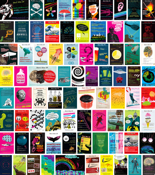
Nerd Nite SF event posters, 2010–present |
Event poster, 2011 |
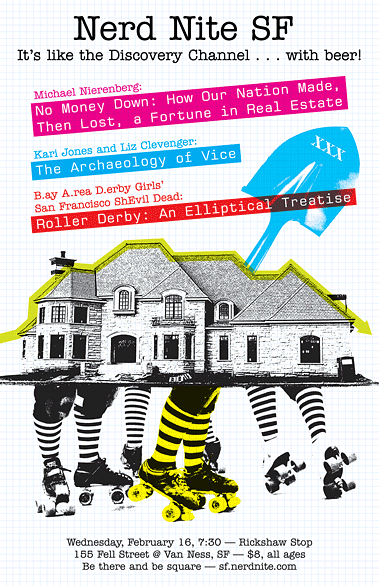
Event poster, 2011 |
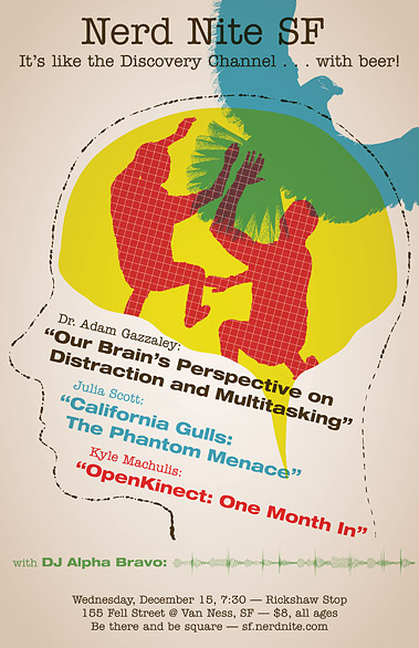
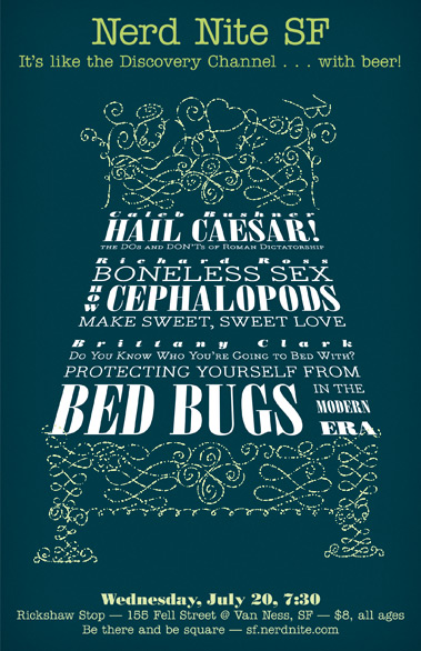
Event poster, 2010 |
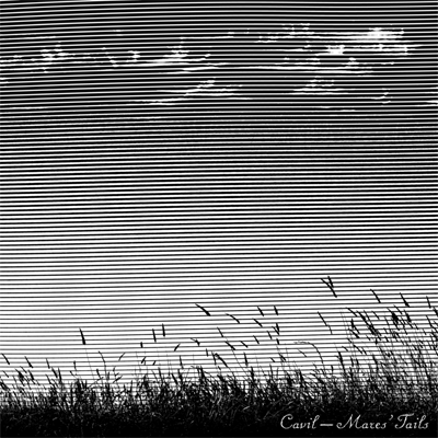
Cavil |

The Hepburns |
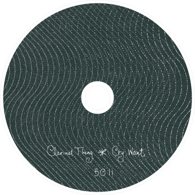
Clarinet Thing |

|

|
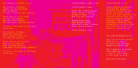
digipak detail & booklet spreads, Bernal Heights Suite |
|||||||||


|
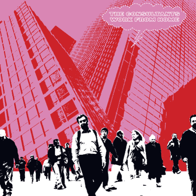
The Consultants |

The Cat Box Quartet |
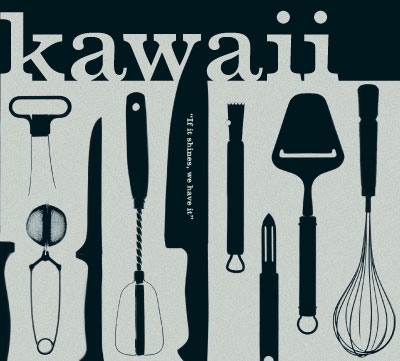
Kawaii |

Testbild! |
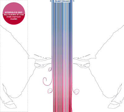
Gypsophile vs. Shop |
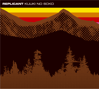
Replicant |
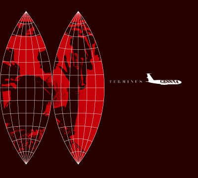
Cessna |
Websites… My own: Radio Khartoum Bügelfrei |
Some I've made for other people: Nerd Nite (global site + ~75 active city sites) Angelique Clark Anne-Katrin Spiess Beth Custer Moontrails | Philip Ames Next Metropolis Cavil AI’s Human of the Year |
 |
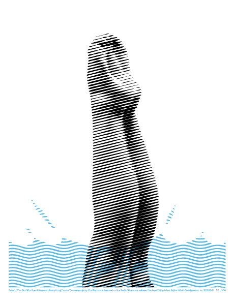
 Testbild! / Anthony Rochester The Return of Everson K 45rpm labels for Radio Khartoum, 2005 |
While the bulk of the album artwork was done in a style of high contrast, monochromatic images overlaid by straight hairlines, this singular image uses a different technique: an oversized traditional halftone pattern which provides realistic shading and contours to the diver's legs, overprinted by a very artificial body of water rendered using a different pattern. Where the water and the legs overlap, we get a moiré, an optical distortion which reenforces the disappearance of the song's protagonist into indifference. This particular image represents a bridge to style I used for the band's subsequent single, in which I take figurative use of traditionally abstract design elements (moiré and op art effects) to technicolor levels. Because of this bridge, we chose to use this design—extracted from deep within the album's booklet—for a promotional postcard promoting both the album and single's release, as well as for this poster for the album alone.
|
 |
|
Second hand records on Discogs |
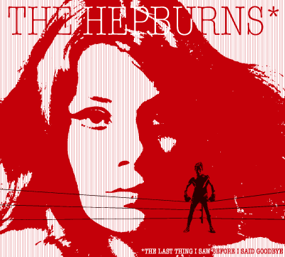
The Hepburns |
||